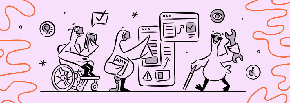
Crafting a Culture of Accessibility, One Feather at a Time
Embark with me on an exploration of how we've cultivated an accessibility-inclusive culture at Goosechase, feather by feather.
I'm Harmony – a mom, iOS and Android Mobile Engineer, and perpetual traveler with a mission to shape a digital world where diversity isn't merely acknowledged, but joyously celebrated. My accessibility journey spans diverse industries, from financial services and ecommerce to running an indie accessible mobile gaming studio.
My passion for accessibility is rooted in a profound belief –
Accessibility is not a mere checkbox; it's a commitment to recognizing and celebrating the distinctive essence of every user. It's a dedication to crafting a digital experience where each interaction resonates with the tapestry of human diversity and compassion.
Let’s talk about how Goosechase actively promotes an accessible culture, how we use industry standards and principles of accessibility to guide our decisions and have integrated them into feature development. I’ll share how we’ve used this knowledge to build a culture of accessibility, wherein accessibility isn’t the weight of one individual or department, but a valued consideration for everyone in our flock. 🪺
A Peek Into My History with Accessibility
Technology has always been a race – being the first to revolutionize and transform our lives defines the successes and failures in space. This unfortunately has left a substantial number of users behind the curve, unthought of and unable to use a new technology. Millions, in fact. Who are these users? They are the ones that require the use of assistive technology, that have an impairment in mobility, cognitive, visual, auditory or multiple.
I’ve been working in the mobile accessibility space for over a decade. Historically, the pushback has been:
"Accessibility is a numbers game. Accessibility is hard. We have more important features to build."
It has been interesting to see the industry waking up to accessibility. As more laws are implemented to protect users that have accessibility requirements, more people are starting to pay attention. It’s a sad, unfortunate truth that many corporations don’t consider the benefits of accessibility until they’re slapped in the face with a lawsuit.
I remember in a past role, I had just switched from working on a project dealing with mobile wallets, to working on mobile deposits. At this point in my career, I had already worked on multiple accessibility projects within the company. So I was surprised when I realized 3% of our user base couldn't use our remote deposit features.
I asked a colleague, a veteran who had lost his sight during his service, how he used this part of the app. He said he didn’t. He explained that he would, in most cases, not accept checks as a form of payment. When he had no choice but a check, he hoarded them to make hiring a driver to make a trip to the bank worth it.
Immediately, I knew that this was something I had to fix.
I was in a pitch meeting for an internal innovation competition, where the idea was simple: by leveraging existing Mobile Operating System (OS) features TalkBack on Android and VoiceOver on iOS, as well as the existing mobile check deposit already existing in all its glory, we would simply add verbal directional announcements.
I was immediately asked, “Why?”. Many times after and throughout that journey, from prototype to production, I was asked “Why?”, or a crass “Are the numbers high enough to even accommodate an accessibility feature?”. It’s a pretty big deal in the FinTech industry to innovate and have the claim to be first, but even then, even when the amount of deposits the feature enabled skyrocketed, still people wondered Why?
Mobile devices are literally my life. I can’t imagine my world without one, and I’m sure most people can identify with that. I also know that when software doesn’t work the way we believe it should, it can be catastrophic. Why then are we okay with writing off a huge portion of our population, and preventing access to the same tools that are an integral aspect of our everyday lives?
A Peek Into the History of Accessibility
The history of accessibility resonates with enduring relevance, transcending mere trends and marking a transformative journey. Its roots extend far beyond the Americans with Disabilities Act (ADA) of 1990, weaving a narrative that adapts to the evolving landscape of legislation. This journey is a continuous effort to ensure that everyone, regardless of abilities, has seamless access to the information and technology integral to society.
In essence, accessibility is not about framing disability as a problem to solve; it involves acknowledging and respecting human diversity by creating solutions and technologies that facilitate various means of access. It is necessary for accessibility to be integrated into the fabric of digital culture. It serves as the compass guiding the construction of equitable access paths, not just for users but also for the designers and engineers shaping these digital landscapes.
Accessibility isn't an add-on or even a feature; it's about emphasizing and integrating it into the foundation of every digital endeavor. While some companies resort to band-aid solutions for immediate accessibility concerns, these hasty fixes lack the foundation for sustained inclusivity. They result in software that is barely functional for users relying on assistive technology.
The question that echoes through this journey is simple: Why should anyone deserve a lesser experience? The resounding answer is they don't.
Our Acccessibility Standards and Principles
Crafting an inclusive digital experience goes beyond the realm of skilled coding or beautiful designs. It demands a holistic approach where everyone contributes.
At Goosechase, we've spread our wings beyond engineering, ensuring that every aspect of our operation contributes to the culture of accessibility. When accessibility isn’t an afterthought, it’s actually pretty easy to accomplish.
The depth of accessibility knowledge usually begins and ends with compliance. Many know of the three levels of Web Content Accessibility Guidelines (WCAG) compliance: A, AA, AAA.
- Level A criteria are critical requirements. Content that meets this level provides a slightly accessible experience, but will require considerable effort from the user to navigate using assistive technology.
- Level AA criteria are high priority requirements. Content that meets this level will generally provide an acceptable level of accessibility, but in some cases may not provide fully equivalent access.
- Level AAA criteria are medium priority requirements. This is the highest level of accessibility standard and a flight path to making a truly delightful experience for any and every user.
It's important to recognize that accessibility needs are ever-evolving. Software needs to look beyond compliance to be truly inclusive.
At Goosechase, we work extremely hard to design interactive experiences that are educational and delightful for everyone. So we took some notes from various resources throughout the industry, such as the American with Disabilities Act (ADA), the Accessibility for Ontarians with Disabilities Act (AODA), and the United Nations Principles of Convention (UN).
Our accessibility standards - equality, dignity, independence, and opportunity, ensure that our interactive experiences don’t stop at compliance.
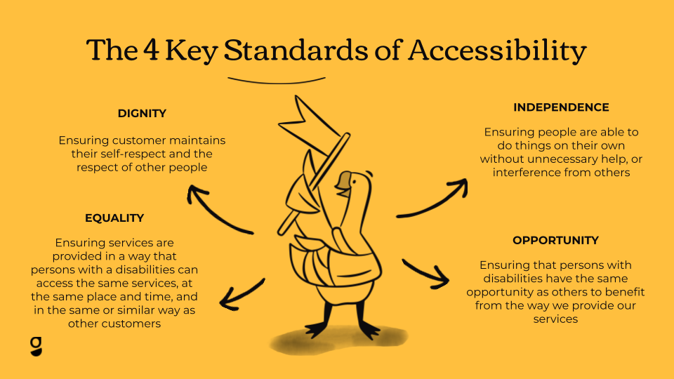
- Equality - Ensuring services are accessible to all, at the same time and place, and in a similar manner as for other customers.
- Dignity - Maintaining the self-respect of the customer and the respect of others.
- Independence - Empowering people to do things on their own without unnecessary help or interference.
- Opportunity - Providing persons with disabilities the same opportunities as others to benefit from our services.
The WCAG documents also provide us with our accessibility principles: Perceivable, Operable, Understandable, Robust (a.k.a POUR), that allow our engineers, designers, and authors to create mobile and web content. These principles are internationally agreed upon for creating accessible digital content.
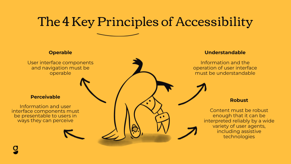
- Perceivable - Making information and user interface components presentable to users in ways they can perceive. For example, providing text alternatives for non-text content.
- Operable - Ensuring user interface components and navigation are operable.
- Understandable - Making information and the operation of the user interface understandable.
- Robust - Ensuring content is robust enough to be reliably interpreted by a wide variety of user agents, including assistive technologies.
In practice, POUR is often considered compliance, and more often than not a part of the engineering burden. But it too can be more. One of my favorite accessibility decisions at Goosechase involves our gaggle of illustrated geese. In many cheeky circumstances, they’re non-informational (just there to provide comedic relief), and thus traditionally ignored by the screen reader. We ensure they have context and delightful descriptions so screen reader users can enjoy them, too.
Accessibility at Goosechase Today
Our commitment transcends our software, reaching into the heart of our brand. The journey of accessibility has introduced us to a myriad of diverse personas, and we are dedicated to maintaining an open line of communication that adapts to our customers' ever-changing needs.
Actively monitoring and continuously improving our software, we understand the profound impact words can have. Beyond just alternative texts, we recognize that each word and heading serves as a feather contributing to the expansive wingspan of accessibility.
- For our design team, accessibility is not an afterthought; we seamlessly integrate it into our creative process by embracing intuitive and simplified designs that cater to diverse needs. From color palettes meeting contrast requirements, to graphics scalable without quality loss, our design guidelines incorporate accessibility principles for every design component. Our entire team participates in what we call design crits and everyone contributes to accessibility discussions.
Our flight toward accessibility is fortified by robust tooling. Accessibility scanners for web, mobile, and content serve as our navigational instruments. Manual testing, peer reviews, and ongoing training contribute to the strength of our commitment. We also dedicate time to learning about accessibility, brainstorming and sharing industry updates on Slack. - When it comes to customer-facing interactions, take our custom workshops, for example. Onboarding materials are a key tool for our Account Managers during these sessions. Our introductory deck had many rounds of review, ensuring readability with legible colors and fonts. Although image use is minimal in this presentation, any included visuals, charts, or graphics are equipped with descriptive alt text or captions.
There is also a conscious effort to incorporate accessibility within the custom Experience templates Account Managers make for annual subscribers. For example, if a Mission were to ask people to go to a certain location, we'd make sure it's not requesting that they use a specific mode of transportation, but rather that it gives them the choice of what mode they want to use.
Our Active Pursuit of an Inclusive Future
Across every line of business, from design to content creation, engineering to brand development, we are cultivating an atmosphere where accessibility isn't merely a consideration; it's an integral part of our identity.
I have been an accessibility advocate for a very long time and for the first time in my career, it’s not just me and a few “accessibility friends”. Everyone at the company is talking about it and taking it into consideration. They have a sense of pride when crafting accessible experiences. Many of my colleagues are new to accessibility, and it’s been an amazing experience to watch their accessibility plumage grow. We’re all striving to craft not just a passable accessible experience, but one that is delightful for everyone. One where everyone can behold our geese puns in all their glory.


