The Lowdown on the Logo
Honk off the press: We're so excited to share our new logo.

As of today, you should see new logos across all our properties: the app, Experience Manager, website, our blog (👋), social media, and our community (which is currently in the works…IYKYK). We hope it looks right at home with the palette of fun hues and playful geese illustrations we rolled out earlier this year.
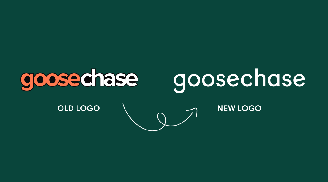
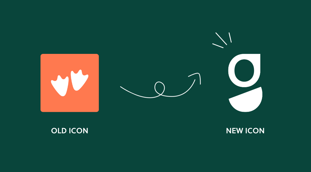
Before and after
Why the change? Our former logo came about at a time when our product and customer base were growing faster than our branding, and it served us well for nearly 10 years (shoutout 99designs!).
But we’re at another point of growth, and the little-logo-that-could suddenly didn’t feel very Goosechase. As we moved from a scavenger hunt app to an interactive experience platform, we wanted a look and feel that echoes the know-how and excitement of our team and customers who are building the vision for interactive experiences together.
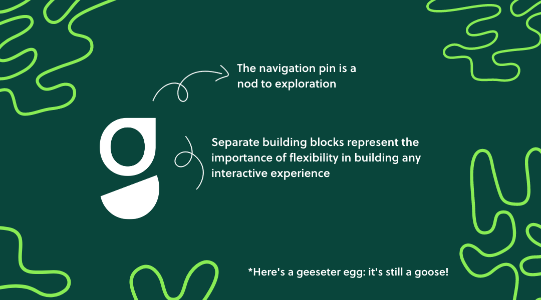
We had seen a lot of mock-ups that featured a location pin, which makes sense given our beginnings as a scavenger hunt app. But we’re really more about the journey than the destination. The navigation pin's nod to exploration represents that well.
Andrew Cross, CEO @ Goosechase
We're digging our sleek, modern new look, and are excited about all the phases of change the new Goosechase logo will see us through. We think it nails the brief to represent our promise to empower folks like you to engage, activate, and educate your communities through delightful interactive experiences.
If you're interested in reading more about the process behind the scenes and our advice for rebranding b2b companies, keep on scrolling. 👇
"I’d like to see it somewhere unexpected but still useful, on something that might take you by surprise. Like a golf ball. It’s like a little easter egg to find delight in."
Andrew Cross, CEO @ Goosechase
"Like Andrew, I like to go for the unexpected...I'd love to get an egg-shaped stress ball, or even figurines of our goose illustrations. Or our branding peeking out the pocket of an otherwise normal hoody."
Hannah Catmur, Head of Design @ Goosechase
Visions of Goosechases Past
It wasn’t just that our old logo didn’t feel like us - it didn’t look like us, either. The dual font colors felt disconnected, the gradient didn’t quite go with everything, and the wordmark didn’t say much about our personality. The icon featuring the goose feet was fun, but it leaned too literal.
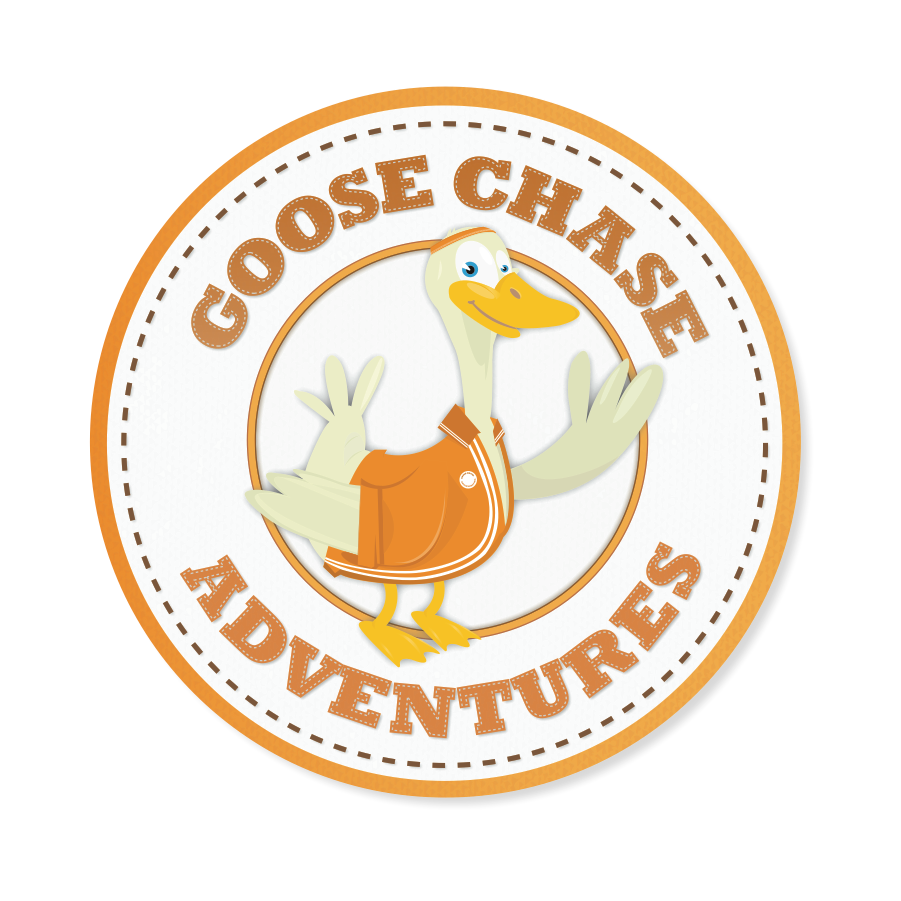
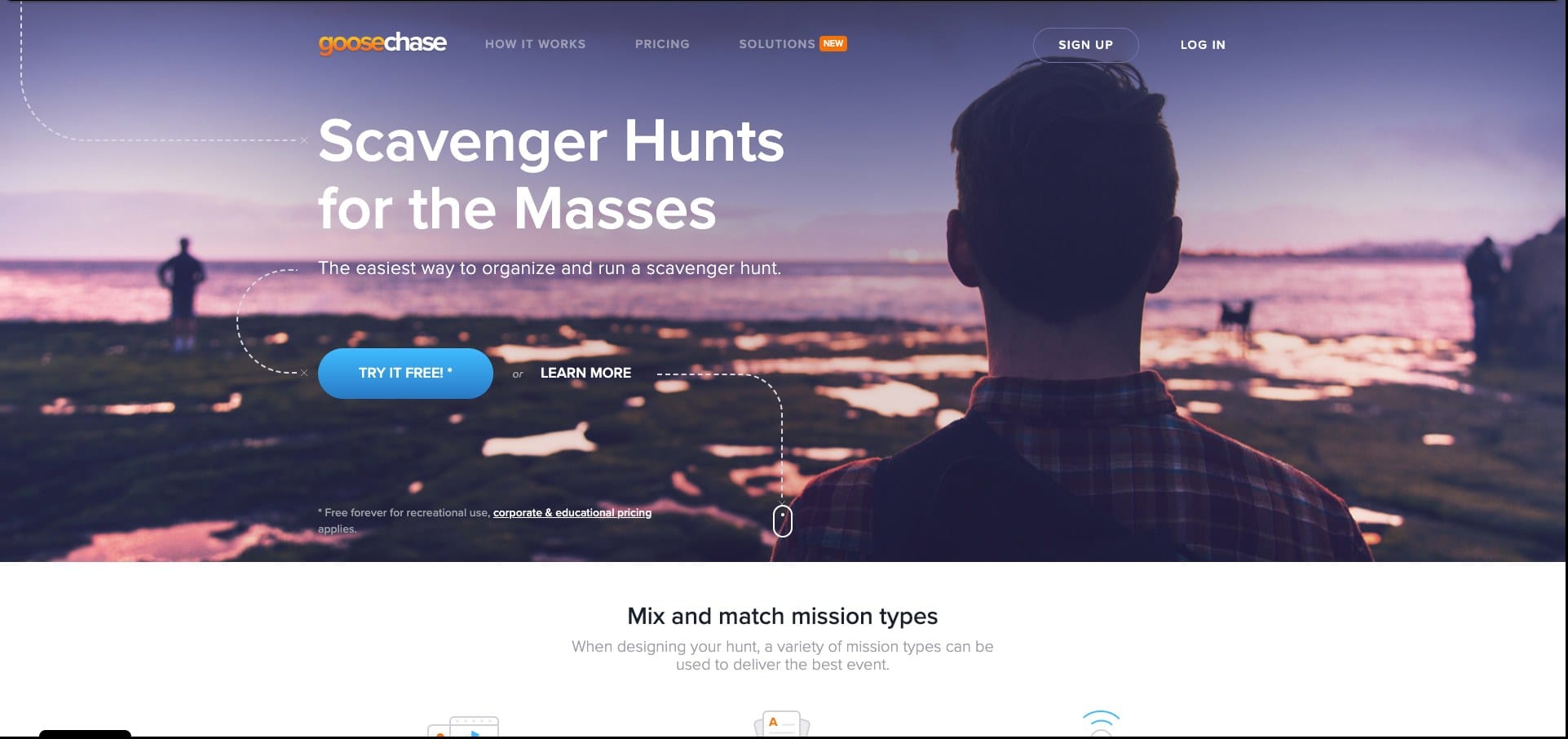


For your viewing pleasure: earlier versions of Goosechase branding
It felt disconnected from the brand we wanted to be - it was a little rigid, not playful, not future-thinking. It didn’t resonate with the future focus we had.
Andrew Cross
This was our opportunity to come up with a coherent visual story that would draw folks in, build up the suspense, and nail the punchline. AKA a brand worth paying attention to.
So we brought in reinforcements.
Fluffing our feathers: How we got our visual brand right
We invited Renga to the table, a brand identity and design studio from Toronto that specializes in innovative startups. Their team was tasked with distilling our 10 years of experience and 20 opinionated voices into a cohesive brand guide that looked, sounded, and felt very much like us. And like our customers, too. And they did it!
More than anything, the brand's visual identity is inspired by the people - both the Goosechase team and passionate users - it represents. It was easy to inject the Goosechase brand traits (light-hearted, imaginative, cheeky, and unexpected) into the visual identity because they truly represent the great team of people behind it.
Landon Wideman, Lead Designer @ Renga
At the end of a process that took many weeks of hard, creative work, we ended up with a comprehensive guide to what Goosechase should look and sound like. The Renga team was instrumental in holding up a mirror to the company, refining our vision, and defining who we are as a brand. The colors, fonts, and quirks you see throughout our product, website, and even Instagram feed came from those reflections.
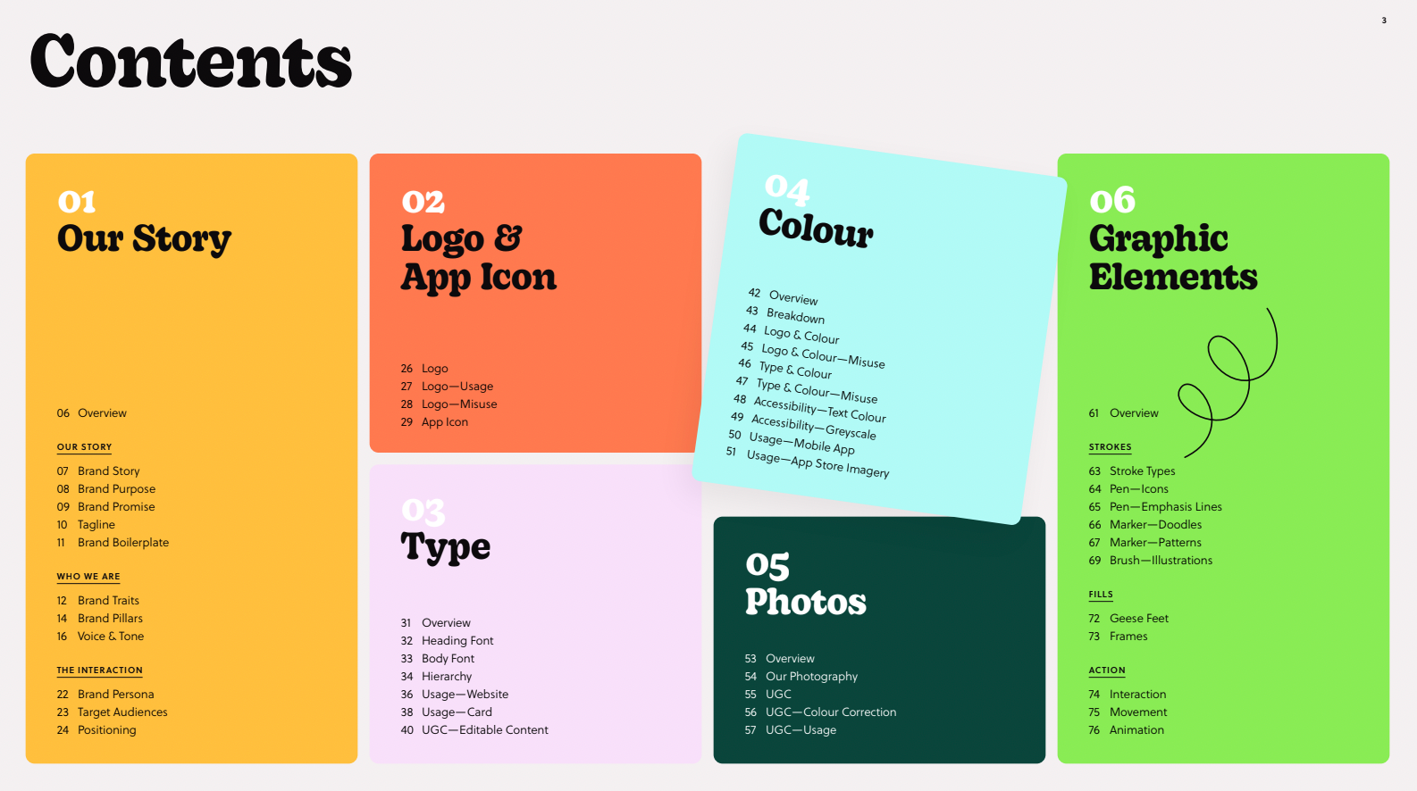
Getting the logo just right was a wild goosechase…until it wasn’t
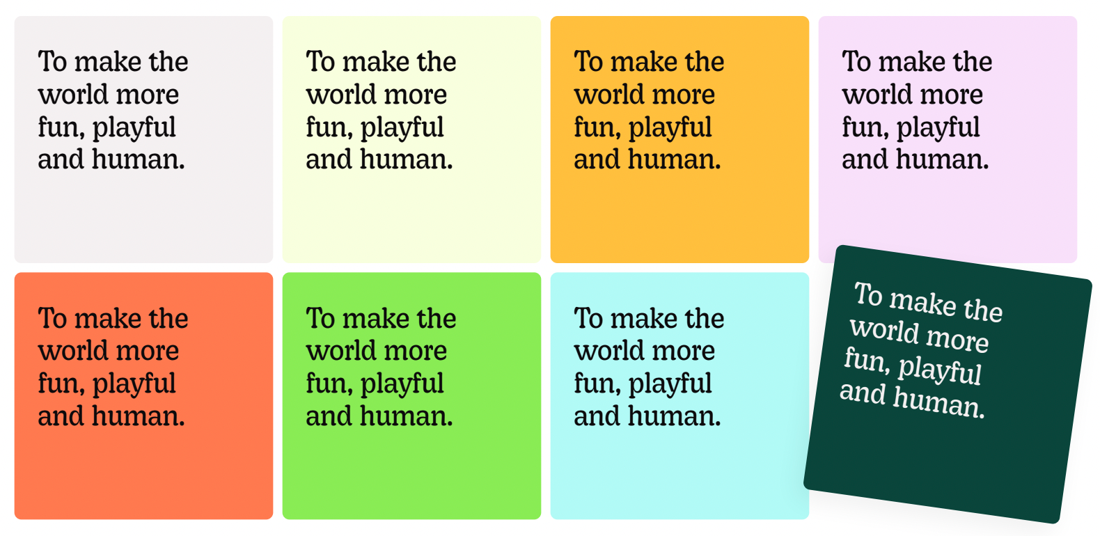
When it came to perfecting the logo, we wanted both a wordmark and icon that captured the essence of our brand mission - to make the world more fun, playful, and human - without being too literal or juvenile.
I didn’t want either the 'goose' or the 'chase' teased out too much, because we're Goosechase. We aren’t just about the chase, nor just about the goose, so we were looking for something really coherent.
Andrew Cross
With a strong new visual identity in place, we sought the expertise of brand design agency Jacknife. Having seen their work with a number of other players in the tech and B2B space, we felt our feathers were in the right hands. They had the fun challenge of retrofitting a new logo for our playful new branding.
The strength of personality of the existing identity was both the hardest and easiest thing about designing the Goosechase logo! The answer for the logo itself lay in creating a clean, simple wordmark and icon that could hold its own within the colorful and playful branding.
Kristi Korotash, Senior Graphic Designer @ Jacknife

Advice for other B2B companies going through a rebrand
The road to this final product was years in the making: long, hard and winding, as they say. Here’s a bit of advice for companies looking for elevated b2b logo ideas or that are interested in a rebrand:
- Let customers and their language lead the way: None of this would have happened if our community's creativity hadn't propelled us beyond a simple scavenger hunt and into interactive experiences. Talk to your customers often and listen to the language they use.
Fun fact: In many of our customer interviews, we ask them to describe Goosechase in 3 words - it's a quick question that gets you valuable insights. We fed a lot of the most common answers to Renga and Jacknife during the design process. - Look to the design experts: You may know your company inside out, but lean on the expertise of those outside your organization to bring in perspectives from other industries. Something that seems crystal clear to you may be clear as mud to the outside eye, and you'll want to tackle that murk early on.
- Have a clear vision for your company’s voice and tone to help set the scene for designers.
The final logo was very much the result of a great collaborative process, and the client’s clear understanding of their brand and sense of how the logo fit within it was a huge help to us. The team’s clarity in terms of truly knowing what they wanted meant we were able to be creative without losing focus. Essentially the opposite of a wild goose chase!
Kristi Korotash
- Put your customer's experience at the center of change: Accessibility plays a huge role in how we think about our product, and brand design is no exception.
- ...speaking of experience, don't neglect that of your employees, too: Your employees are your ultimate champions. Get existing employees excited about the rebrand by giving them moments of delight pre and post-launch.
At the very end of the project, Hannah asked us to create a goose emoji to be used within the Goosechase team's internal Slack. I think the emoji was a huge win, and we still use it even within Renga's Slack!
Landon Wideman
- Empower your evangelists: We also want to give customers access to assets like our icon and wordmark to use for their marketing or internal needs. Ensure your final deliverables are as user-friendly as possible!
- Trust your gut: We received mock-up on mock-up, from all different designers, of logos that leaned heavily into goose imagery. While they were fun, something in our gut said that path wasn't quite right. And now we're here!
The amount of times we tried for a goose and ended up with something that looked like a duck was hilarious. Fun fact: they look alike!
Andrew Cross
As more interactive experience platforms enter the mainstream, we're excited to be front and center with new logos that feel unique, iconic, and authentically us.
What is Goosechase?
At Goosechase, experience is everything. Originally inspired by scavenger hunts, Goosechase is an online platform that enables organizations and schools to engage, activate, and educate their communities through delightful interactive experiences. Sign up and try creating a free recreational Experience, or check out our Pricing!


