A Peek at Design Crits at Goosechase
How we facilitate effective design feedback sessions. Aaand we're sharing our Miro board template, too.👇
Hello! I’m Alice, Lead Product Designer at Goosechase. My role is to help design all the things that our customers use to create and take part in Goosechase experiences - whether it’s our Goosechase Studio, or our iOS and Android apps.
Today I want to share some behind-the-scenes insight into how we run Design Crits at Goosechase; one of the key design activities that we rely upon to refine our work and generate ideas. Crits are a tool that I have used in all my previous roles and seen various iterations of. There is no true right or wrong way to run Design Crit sessions; the key is to experiment and find the right format and cadence for your own team.
So, what exactly is a Design Crit?
A Design Crit, short for design critique, is an informal, creative
get-together where the team gathers to share and comment on
works-in-progress.
While some companies restrict Design Critiques to "designers only," here at Goosechase, we embrace an open-door policy. Our design and marketing teams are regular attendees, but we firmly believe that every individual within our organization holds their own expertise and brings a treasure trove of valuable insights to the table. In fact, anyone, and I mean anyone, can step right up and seek feedback—no exclusive ‘designer’ pass required!
Design Crit isn't just for marketing assets or product design. We believe it can be a valuable tool for improving slide decks, internal resources, customer support materials, and much more. And our flock-mates in other departments often bring the freshest viewpoints!
What happens at Design Crit?
Our Design Crit is a 45-minute-long session held every other week. The day before, I post in our company's Slack asking who would like to share something at Crit, and folks raise their (figurative) hands ✋. As the facilitator, I will then share around our Miro board, for presenters to add their ‘work in progress’. This could be some wireframes, a rough sketch, some draft copy, or really anything that they want to gather opinions on.
Because we’re a fully remote workplace, we run Design Crits over a video conferencing call, and use a shared Miro whiteboard to collaborate in real-time. This method could easily be adapted to work just as well in person with actual sticky notes and printed materials, or using individual devices to access the online whiteboard.
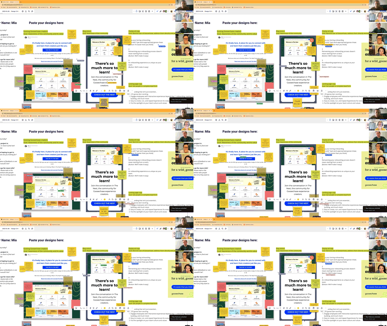
Each presenter takes a couple of minutes to talk through their work, and then we set a short timer (usually 5-8 minutes, depending on the complexity of the content requiring feedback). The attendees then use this time to let loose with sticky notes! At Design Crit, we encourage attendees to plaster as many sticky notes as they can muster. Why? Well, every single thought, no matter how small, holds significance because it allows us to spot common themes. We owe this approach to the copywriting pioneer himself, Gary Bencivenga, who championed this method way back in the 1970s. He urged his colleagues to go wild, adding hundreds of notes on each other's work.
Volume, ultimately, is the secret. Because volume presents overlap, which illuminates themes, patterns.
- Very Good Copy
So, our team channels their inner Bencivenga and leaves sticky notes capturing every reaction, opinion or thought they have relating to the work! The more, the merrier—we're all about capturing those golden insights and uncovering the collective wisdom within our team.
Once the timer ends, we briefly open the floor for any clarifying questions from the presenter, or anyone in the room who wants to elaborate on their sticky notes. The facilitator (that's usually me!) may call out any obvious themes that have emerged from the colorful sea of sticky notes. And then we swiftly transition to the next presenter, keeping the momentum going!
While many organizations opt for a 'round table discussion' style for Design Crits, we have really embraced the sticky note method. A round-table discussion inevitably amplifies the voices of the loudest and strongest opinions, limiting the conversation to just one line of thought at a time. It also fails to fully capture all the "yes, and..." thoughts that may occur along the way. Plus, it can be challenging to fully capture and retain the essence of a verbal conversation.
The sticky note method leaves our participants with a treasure trove of feedback they can refer back to as they refine their work. It's like having a visual map of insights, allowing them to reach out and connect with the individual commenters later if they wish to discuss further.
Finally, we always make a video recording of our Design Crit sessions, and add them to a Notion page. Our colleagues who couldn’t make the session can still watch, and our attendees can replay parts of the conversation if needed.
The rules of a great Design Crit
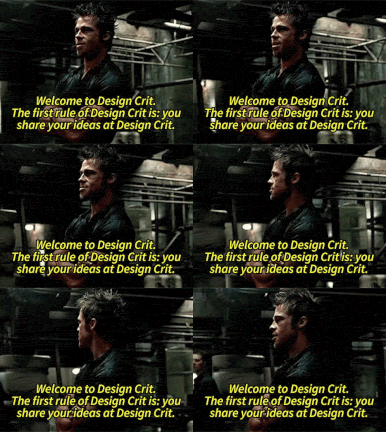
There are some basic rules of how we run our Design Crits:
- Judgment-free zone: Design Crit is all about those works-in-progress, especially the early concepts that are still rough around the edges. It's not about fancy presentations—actually, the earlier and scrappier, the merrier! Remember, Design Crits lose their value when they turn into a mere "show and tell" session. We aim to embrace the imperfections, leave our egos at the door, and dive into the collaborative spirit of critiquing and refining together!
- No “design by committee” here: Design Crit is a fantastic way for gathering lots of diverse opinions. However, it's important to note that the presenter is not obligated to act on every single piece of feedback. Presenters use their judgment to discern which insights will truly enhance their work.
- Strive for constructive honesty: Remember that presenting your rough work is inherently vulnerable. While a comment such as "This is bad" is unhelpful and demoralizing, a comment such as "This copy is confusing" could be very valuable feedback.
- Everyone is welcome: We all have different expertise and insights. We embrace the diversity of perspectives and acknowledge that great ideas can come from anyone, regardless of their role or department.
- Design Crit is strictly not for making major decisions or planning roadmaps: Those processes take place elsewhere. Crits exist to unblock the presenters, to provide a safe and supportive environment for ideation, and to tap into the collective knowledge and expertise of the whole company.
- Mind the time: 45 minutes is intentionally short and sweet, and the facilitator’s role is to monitor the clock and keep things moving. We aim to avoid drawn-out debates; if a major difference of opinions or tricky problem is identified, that discussion can continue offline. Design Crit has already served its purpose of identifying the problem in the first place!
So you want to introduce Design Crits for your team?
Awesome! We’ve shared our Goosechase Design Crit Miro Template so that you can use it within your own organization.
Log in or sign up for Miro, and then simply copy this template to your workspace. Feel free to tweak and adjust for your own specific needs.
It's not just about designers, but all the talented folks in your organization. Picture this:
- Product teams fine-tuning their user interfaces and wireframes, whilst getting fresh perspectives from other departments.
- Marketing teams testing out their ads, landing pages, and social media content to make sure they hit the mark before they go live.
- Content teams leveling up their draft articles, documentation and copy, with a little help from their friends.
- And let's not forget about all the other departments who can benefit from Design Crits… People teams can gather feedback on onboarding materials and training resources from the very people they’re supporting. Customer support teams can test out support materials and knowledge bases. Sales teams can use Crits to refine presentation decks and sales collateral until they really shine.

We love the fact that Design Crits bring together folks from all different areas of expertise, and leverage the collective wisdom of your entire team. You will be surprised where those brilliant ideas will spring from. It's a chance to tap into the collective brilliance of your team - and not only that but Design Crits are fun! They foster cross-team collaboration and connection, helping folks build connections and bond over creating amazing things together.
I hope this inspires you to explore introducing Design Crits with your own team!
What is Goosechase?
At Goosechase, experience is everything. Originally inspired by scavenger hunts, Goosechase is an online platform that enables organizations and schools to engage, activate, and educate their communities through delightful interactive experiences. Sign up and try creating a free recreational Experience, or check out our Pricing!


